Rotating banners or carousels – those devices so beloved of web designers – could be killing your conversion rate.

Really? Carousel conversion rate killer? So say a host of conversion optimization experts after subjecting image sliders/carousels/rotating banner devices to a whole battery of usability tests. “Rotating banners are absolutely evil and should be removed immediately,” states Tim Ash, one of the aforementioned experts and author of “Landing Page Optimization”. [1]
What is the carousel conversion rate? Are carousels ‘conversion killers’?
What’s so bad about carousels? After all, they showcase a whole load of images and messages, which means they save precious space on any website page.
Users ignore carousels – they think they’re banner ads
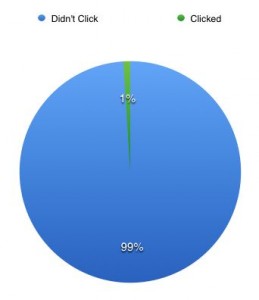
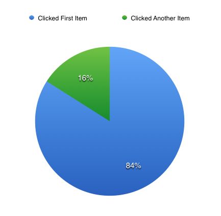
Users ignore carousels, according to Jakob Nielsen [2], a leading usability expert. Because carousels move, users automatically assume they must be advertisements, which makes them more likely to ignore them. What users ignore, they don’t take action on. That means your conversion rate stays the same or plummets. Disaster! Nielsen’s claim is borne out by a conversion study conducted on five Notre Dame University websites with carousels [3]. The study revealed only 1% of all visitors clicked on a feature on the carousels. Of those who did click, 84% chose the first thing on the carousel.

Surprisingly, only 1% of visitors actually interacted with carousels.

Of the 1% of visitors who clicked on an image carousel, most clicked on the first item, not later items.
Carousels take up valuable space on your website
There’s another reason for calling the carousel conversion rate killer: they take up some of the most valuable space on your website where visitors usually land. It’s where visitors should see your website’s value proposition: a clear statement that explains how your product/service solves customers’ problems or improves their situation, delivers specific benefits, and tells them why they should use your services and not those of your competitors. It’s the most important part of the home page or any other landing page because it determines whether people will bother staying or going. It should appear on the home page as a concise chunk of text (headline, sub-headline and maybe a few bullets points). If it doesn’t, the chances of visitors staying on the website for more than eight seconds are slim. Tim Ash lists a load of other reasons for calling the carousel conversion rate killer. They include: Their large file size (which slows down page loading times – a big no-no as far as Google is concerned) They waste visitors’ time (and, as you know, most website visitors want instant gratification and give short shrift to any website that doesn’t deliver on immediate expectations) They push navigation down the page (where it might not be noticed). But wait, as they say in infomercials, there’s more. Many more reasons to think carousel conversion rate killer…
Carousels have poor usability
Image sliders/carousels often move too quickly for users to take in the image or message. If there are navigation icons, they’re not always easy to see or use. The result: frustration or confusion on the part of your visitors. And, when users are confused or frustrated, they don’t tend to stick around. Instead, they click on the ‘back’ button and leave. That will kill your conversion rate.
Test, test and re-test
So, if you care about your conversion rate and your website features a carousel, test the impact it’s having on your results. Today! What’s your experience of carousels? Have you tested the impact they have on your conversion rate? Sources: [1] Ash, Tim, ‘’Rotating Banners? Just Say No!’, April 3, 2012, www.clickz.com [2] Nielsen, Jakob, ‘Auto-Forwarding Carousels and Accordions Annoy Users and Reduce Visibility’, January 19, 2013, www.nngroup.com [3] ‘Carousel Interaction Stats’, Weedy Garden Online Home of Erik Runyon, January 22, 2013, www.weedygarden.net


