website code

WordPress Maintenance: The Importance of Updates

Due to its distinct benefits over other content management systems (CMSs), WordPress sites are becoming increasingly popular among businesses of all sizes. Its ubiquity, though, comes with a downside—WordPress sites are now a more attractive target for hackers and bots attempting to gain access to your database. In order to protect yourself from these vulnerabilities, it’s important to maintain your website by installing the latest updates on a regular basis.

Read more

Custom Wordpress Theme - Travel Agency

WordPress Backups: The Value of Automated Protection

Stuff can go wrong

Just like it’s important to backup the data on your hard drive, it’s equally as vital to ensure that your WordPress database and files are backed up and stored safely. Even though WordPress offers top of the line security, there are numerous ways in which your professionally designed, custom website data can become corrupted that may be outside of your control. For example, many businesses fall prey to hackers attempting to gain access to information that is being stored on their databases.

Read more

Legal Web Designers

Attorney Web Design – 5 Tips for Legal Websites

The legal sector is known to be saturated and lucrative, which means that competition among firms for new clients can be fierce. Many law firms have taken their search for new clients online, implementing internet marketing strategies in order to expand their client base. The design of your law firm’s website will have a tremendous impact on its ability to attract new customers, and attorney web design is highly specialized. Below you’ll find 5 tips to optimize the web design of a legal website: 

Read more

Custom Wordpress Theme by RemedyOne - Lighting Company Website

Custom WordPress Themes – Increase Leads with a Unique Website

As the internet’s leading Content Management System (CMS), there are over 60 million websites powered by the WordPress platform, including businesses of all sizes. WordPress has developed a stellar reputation as the meeting point between simplicity and functionality, allowing business owners a user-friendly medium for developing websites that produce results. While WordPress offers free templates in order to get a feel for their platform, it’s only by designing a unique website that your business will be able to reap its full potential. 

Read more

Custom Wordpress Theme - Travel Agency

Custom WordPress API Integrations for your Website

What is an API?

In simple terms, an API (application programming interface) is used by programmers to enable internet databases, apps, or pieces of software to interact with one another. By doing so, it automates the flow of data so that different services can be integrated with one another seamlessly.

For example, a popular API that you’ve probably seen on a website or mobile app is the Twitter API which displays the latest tweets relevant to the subject matter at hand. Another common API used by many businesses is the Google Maps API, so that customers have the information they’re looking for integrated into the web page that they’re already viewing. Essentially, Google has enabled third-party web developers the ability to integrate Google Maps into apps or web pages in order to facilitate mutually beneficial relationships.

Who are APIs for?

One of the common misconceptions is that APIs are only useful for large businesses, but now there is increasing acceptance of the idea that businesses of all sizes can take advantage of the unique benefits of integrating APIs into their websites. The good news is that WordPress allows businesses to stimulate growth by integrating APIs into their websites, bringing API integration to millions of different businesses.

APIs will allow your company to collaborate with a wider circle of partners, spearheading new opportunities for your business. Just as importantly, APIs will make your website more user-friendly and improve the experiences that customers have while using your website. It will also ensure that customers stay on your website, rather than surfing elsewhere for information that has been integrated using an API.

Custom WordPress API Integrations

As mentioned above, WordPress has made it possible to integrate APIs into your website as a means of enhancing its functionality. One of the key benefits of using WordPress is that you have the ability to create a powerful website that is still extremely simple to manage and update. Integrating APIs are a case in point, since it creates unlimited possibilities for your website without overcomplicating the process.

How We Can Help

Here at RemedyOne, we can exponentially increase your website’s functionality by creating custom API integrations for custom third-party software. This means that irrespective of the area in which your business operates, we can integrate APIs that can greatly expand the ways in which you communicate with your customers.

Additionally, we can build our own API integrations from scratch to further facilitate the customization of your website. Best of all, all of our web developing can seamlessly be integrated into your WordPress website, keeping things as simple as possible. If you are interested in a fully customizable website with limitless functionality, look no further than a cutting-edge RemedyOne WordPress website.


Custom Wordpress Theme by RemedyOne - Lighting Company Website

WordPress 4 New Features and Benefits

One of the most defining elements about WordPress over the years has been its willingness to constantly adapt to emerging trends. It’s been this ability to stay ahead of the curve that has allowed it to dominate the CMS market, outcompeting its alternatives by a wide margin. The most recent large-scale update known as WordPress 4.0 includes over 250 improvements to the platform. Below we’ll explain some of the WordPress 4 new features and benefits and why they’ll help you maximize the effectiveness of your websites.

WordPress 4 New Features and Benefits: The Shortlist

Embedded Media

One of the best of all the WordPress 4 new features is the ability to easily embed content by copying a URL into a post. This works for the leading forms of embedded video ranging from YouTube to Hulu, and from TED Talks to CollegeHumor.com. In the past, embedding media was a much more convoluted process, but WordPress 4.0 has streamlined it for our convenience.

Enhanced Media Manager

The Media Library has been given a sleek makeover and now appears in grid form. While the improvements are mostly superficial, they do make it significantly easier for webmasters to search and organize their content. Editing is now easier than before which users will find convenient—all you need to do is click on an image in the grid and a pop-up will allow you to edit the file without exiting out of the screen. Best of all, you’re free to switch back to the earlier style if that’s your preference.

Easy-to-Install Plugins

WordPress has always made it a priority to make the process of customizing your site as easy as possible. It took another step in this direction with WordPress 4.0 by improving the way that users find and install plugins. Plugins will now be listed in grid form, along with key information including descriptions, user reviews, release dates, and compatibility information. Considering the importance of plugins when it comes to search engine optimization and branding, this makeover will positively improve the experiences of many users.

User-Friendly Post Editor

Editing posts is now a more pleasant experience, and you’ll be able to compose posts without scrolling now that WordPress will reshape itself per your browser specifications. This means that the menu bar will remain as a sticky at the top of your screen, making the entire editing process that much more efficient. This is a great example of a subtle improvement that will have a positive impact on millions of WordPress users.

International Appeal

If you’re using WordPress in a language besides English—as millions of its users do—then you’ll be satisfied with the new installation languages that have been added. Translations will be handled more effectively than ever before, which means that its growing user base will start appealing to an ever wider audience. This is big news even for English speakers, since the soaring WordPress user base means that improvements will continue to be rolled out for the foreseeable future.

Wordpress San Diego

WordPress vs Joomla: What’s Best for Business?

Given the competitive nature of today’s business world, there’s little margin for error when it comes to designing your company’s website. The most fundamental choice you’ll have to make is which CMS (content management system) to use, since that will dictate the day-to-day efficiency of your website. Below we’ll compare and contrast two of the leading CMSs: WordPress vs. Joomla.

Search Engine Optimization

Read more

Shopping Cart Abandonment

Shopping Cart Abandonment Issues? How to fix them

If your e-commerce site suffers from shopping cart abandonment issues, take solace in the fact that you’re not alone: the harsh reality is that the global average shopping cart abandonment rate is a whopping 67%.

Put another way: that represents more than two-thirds of your potential sales – gone with the click of the back button!

Fortunately, shopping cart abandonment has been the subject of intense scrutiny in the past few years with the result that a lot more is known about why customers leave websites before buying. And when you know why something’s going wrong, you can do something about it (or hire an expert to do it for you!).

Major causes of Shopping Cart Abandonment

What makes buyers change their minds – and, more importantly, what can you do to fix it?

Consumers hate unexpected costs.

According to a 2012 survey of 19,000 consumers by WorldPay, the number one reason for shoppers abandoning a purchase was unexpected costs.

Fix: Don’t hide your retail taxes or shipping and handling costs. Let shoppers know upfront what charges you’re adding to the final purchase price. Don’t be sneaky and think you can hide the costs until the last possible moment. Do that and you’ll continue to suffer from abandoned shopping carts.

Consumers are just browsing.

Oftentimes, prospective buyers simply change their minds before reaching the checkout. According to Forrester Research, only 3% of shoppers make a purchase during their first visit to a website. Of the remaining 97%, about 71% will pop something into their basket then leave before buying.

Fix: Use retargeting to entice the ‘just browsers’ back. People who’ve put something into their baskets are already part-sold on your product. With retargeting ads, you stand a very strong chance of enticing those would-be buyers back.

Consumers don’t like being made to create an account.

Making users create accounts with you before they buy is another reason for shopping cart abandonment, according to the web research company, the Baymard Institute. ‘Forced account creation’ was the second biggest purchase turn-off (after ‘Unexpected costs’), according to its survey of 1505 internet users.

Fix: Offer users a ‘guest checkout’ option. Don’t force prospects to create an account with you before they’ve made a purchase. You can always offer them an incentive to create an account or opt-in after they’ve made their first purchase.

Consumers are nervous about buying online.

Users are nervous about trusting their personal information and credit card details with a website they’ve never dealt with before. If they don’t see evidence that your website is safe, they won’t want to hand over their credit card details to you.

Fix: Make sure your website features trust signs. Place trust signs on your payment pages. Test the best placement.

Customers hate paying for shipping.

Online users are not only accustomed to getting things free online but they expect it. Worse, a study by ComScore found that 61% of shoppers would abandon their shopping cart if they weren’t offered free shipping!

In Deloitte’s 2014 Retail Industry Outlook, Alison Kenney Paul, vice chairman and U.S. Retail and Distribution leader, Deloitte LLP, said same-day delivery and free shipping are no longer unique, but expected.

“In our 2013 Holiday Survey, 71 percent of respondents said they would take advantage of free shipping if offered. And roughly two-thirds (68 percent) said that they were more likely to shop online if the retailer offered free shipping.”

Fix: Offer free shipping. If possible, offer your prospective buyers free shipping, even if it means you have to make up the costs somewhere else.

These are among the biggest reasons for buyers changing their minds before purchasing. It’s important to know the reasons for your prospective buyers changing their minds. To do that, survey your prospective customers. And as with all things related to conversion optimization, test everything!

A/B Testing: Get Conversions Up by Getting “Down to Science”

As a business owner, you know the challenges of converting visitors into customers. Competition is often high and the window of opportunity is limited. The price of entry for modern day businesses is a website where internet-savvy customers can read, get contact information and shop. But, are business owners in general really getting the most out of their websites? Are you? Learn how A/B testing can help.

Guide Your Visitors

Businesses want to increase sales; that is universal. The strategic use of a website can become instrumental to gaining those results, but the key word there is: strategic. Creating a website and generating traffic isn’t enough. In order for your site to work for you, it is important to make sure that it is optimized to direct potential clients along the path to conversion.

Introducing A/B Testing

This is where A/B testing comes into play. It is a great tool to find out what is beneficial on your site, and what components need improvement. You’re essentially performing an experiment where traffic is split evenly between two versions of your site simultaneously. The original version of the site acts as your control, then you introduce specific variables to the second version to test the difference in your conversions. This allows you to see if the changes you have made affect the amount of visitors you successfully convert.

Testing Your Variables

There are many things that can affect how a person behaves while viewing your site ranging from tone, to placement, to wording. Something as simple as the way you phrase a message, can play a major role in the number of people who perform specific conversions. For example, if you are coming across too forceful, that may cause some visitors to lose trust in your company and leave the site.

Placement can also be a determining factor. Just as the location of your physical business is important, so are the location of videos or call-to-action buttons. Let’s say you’re trying to get your customers to sign up for a mailing list, so you have a set of information fields that a customer fills out. If you have an engaging video above your form fields, it may actually be causing people to stop scrolling before they reach the sign-up portion. With A/B testing, you can move the video below your form fields and find out if your sign ups increase as a result.

The Good Old Scientific Method

A conversion can be anything from signing up for a newsletter, to purchasing a service. When deciding what components to test, you can start with the path that users take to compete the conversion. Examine each step and question what could be done differently. By experimenting, you can gain an understanding about the impact your design has on your conversions and then adjust it accordingly. Here is how to get started:

  • Decide what increase you would like to target and set a realistic goal for your business.
  • Form a hypothesis identifying what changes might help you achieve that goal.
  • Start your testing.
  • Record and analyze your results.
  • Change your site accordingly.

You may be surprised at the difference in results that can occur just by minuscule changes within your page. With A/B testing you can get your conversions up, by getting your website “down to a science”.

Image Slider Carousel on a Website

The Carousel Conversion Rate Killer

Rotating banners or carousels – those devices so beloved of web designers – could be killing your conversion rate.

Image Slider Carousel on a Website

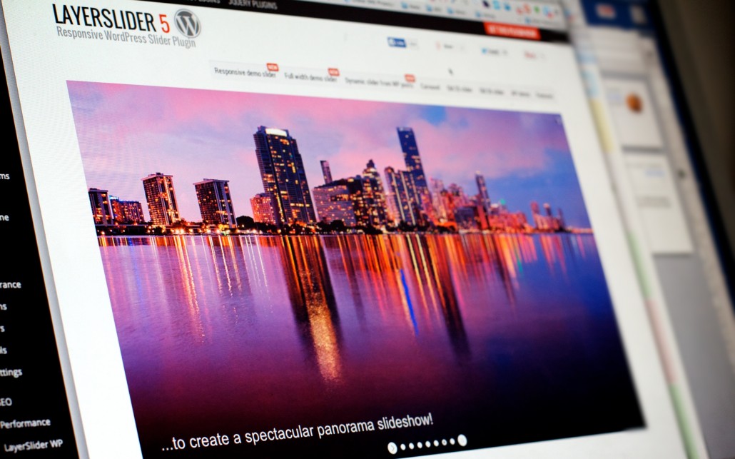
Really? Carousel conversion rate killer? So say a host of conversion optimization experts after subjecting image sliders/carousels/rotating banner devices to a whole battery of usability tests. “Rotating banners are absolutely evil and should be removed immediately,” states Tim Ash, one of the aforementioned experts and author of “Landing Page Optimization”. [1]

What is the carousel conversion rate? Are carousels ‘conversion killers’?

What’s so bad about carousels? After all, they showcase a whole load of images and messages, which means they save precious space on any website page.

Users ignore carousels – they think they’re banner ads

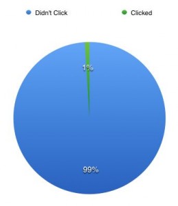
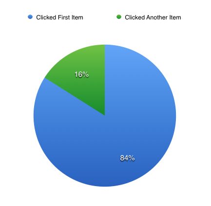
Users ignore carousels, according to Jakob Nielsen [2], a leading usability expert. Because carousels move, users automatically assume they must be advertisements, which makes them more likely to ignore them. What users ignore, they don’t take action on. That means your conversion rate stays the same or plummets. Disaster! Nielsen’s claim is borne out by a conversion study conducted on five Notre Dame University websites with carousels [3]. The study revealed only 1% of all visitors clicked on a feature on the carousels. Of those who did click, 84% chose the first thing on the carousel.

Carousel Conversion Rate - Clicks

Surprisingly, only 1% of visitors actually interacted with carousels.

Carousel Conversion Rate - First vs Later Slides

Of the 1% of visitors who clicked on an image carousel, most clicked on the first item, not later items.

Carousels take up valuable space on your website

There’s another reason for calling the carousel conversion rate killer: they take up some of the most valuable space on your website where visitors usually land. It’s where visitors should see your website’s value proposition: a clear statement that explains how your product/service solves customers’ problems or improves their situation, delivers specific benefits, and tells them why they should use your services and not those of your competitors. It’s the most important part of the home page or any other landing page because it determines whether people will bother staying or going. It should appear on the home page as a concise chunk of text (headline, sub-headline and maybe a few bullets points). If it doesn’t, the chances of visitors staying on the website for more than eight seconds are slim. Tim Ash lists a load of other reasons for calling the carousel conversion rate killer. They include: Their large file size (which slows down page loading times – a big no-no as far as Google is concerned) They waste visitors’ time (and, as you know, most website visitors want instant gratification and give short shrift to any website that doesn’t deliver on immediate expectations) They push navigation down the page (where it might not be noticed). But wait, as they say in infomercials, there’s more. Many more reasons to think carousel conversion rate killer…

Carousels have poor usability

Image sliders/carousels often move too quickly for users to take in the image or message. If there are navigation icons, they’re not always easy to see or use. The result: frustration or confusion on the part of your visitors. And, when users are confused or frustrated, they don’t tend to stick around. Instead, they click on the ‘back’ button and leave. That will kill your conversion rate.

Test, test and re-test

So, if you care about your conversion rate and your website features a carousel, test the impact it’s having on your results. Today! What’s your experience of carousels? Have you tested the impact they have on your conversion rate? Sources: [1]  Ash, Tim, ‘’Rotating Banners? Just Say No!’, April 3, 2012, www.clickz.com [2] Nielsen, Jakob, ‘Auto-Forwarding Carousels and Accordions Annoy Users and Reduce Visibility’, January 19, 2013, www.nngroup.com [3] ‘Carousel Interaction Stats’, Weedy Garden Online Home of Erik Runyon, January 22, 2013, www.weedygarden.net